What is a technical analysis chart?

Charts are the working tools of technical analysts. They use charts to plot the price movements of a stock over specific time frames. It’s a graphical method of showing where stock prices have been in the past.

A chart gives us a complete picture of a stock’s price history over a period of an hour, day, week, month or many years. It has an x-axis (horizontal) and a y-axis (vertical). Typically, the x-axis represents time; the y-axis represents price. By plotting a stock’s price over a period of time, we end up with a pictorial representation of any stock’s trading history.

A chart can also depict the history of the volume of trading in a stock. That is, a chart can illustrate the number of shares that change hands over a certain time period.

Types of price charts:

Line charts

“Line charts” are formed by connecting the closing prices of a specific stock or market over a given period of time. Line chart is particularly useful for providing a clear visual illustration of the trend of a stock’s price or a market’s movement. It is an extremely valuable analytical tool which has been used by traders for past many years.

Bar chart

Bar chart is the most popular method traders use to see price action in a stock over a   given period of time. Such visual representation of price activity helps in spotting trends and patterns.

Although daily bar charts are best known, bar charts can be created for any time period – weekly and monthly, for example. A bar shows the high price for the period at the top and the lowest price at the bottom of the bar. Small lines on either side of the vertical bar serve to mark the opening and closing prices. The opening price is marked by a small tick to the left of the bar; the closing price is shown by a similar tick to the right of the bar. Many investors work with bar charts created over a matter of minutes during a day’s trading.

Candlesticks

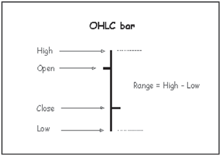
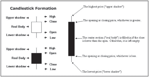
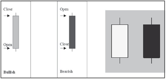
Candlestick charts provide visual insight to current market psychology. A candlestick displays the open, high, low, and closing prices in a format similar to a modern-day bar-chart, but in a manner that extenuates the relationship between the opening and closing prices. Candlesticks don’t involve any calculations. Each candlestick represents one period (e.g., day) of data. The figure given below displays the elements of a candle.

A candlestick chart can be created using the data of high, low, open and closing prices for each time period that you want to display. The hollow or filled portion of the candlestick is called “the body” (also referred to as “the real body”). The long thin lines above and below the body represent the high/low range and are called “shadows” (also referred to as “wicks” and “tails”). The high is marked by the top of the upper shadow and the low by the bottom of the lower shadow. If the stock closes higher than its opening price, a hollow candlestick is drawn with the bottom of the body representing the opening price and the top of the body representing the closing price. If the stock closes lower than its opening price, a filled candlestick is drawn with the top of the body representing the opening price and the bottom of the body representing the closing price.

Each candlestick provides an easy-to-decipher picture of price action. Immediately a trader can see and compare the relationship between the open and close as well as the high and low. The relationship between the open and close is considered vital information and forms the essence of candlesticks. Hollow candlesticks, where the close is greater than the open, indicate buying pressure. Filled candlesticks, where the close is less than the open, indicate selling pressure. Thus, compared to traditional bar charts, many traders consider candlestick charts more visually appealing and easier to interpret.

One cannot ignore that investor’s psychologically driven forces of fear; greed and hope greatly influence the stock prices. The overall market psychology can be tracked through candlestick analysis. More than just a method of pattern recognition, candlestick analysis shows the interaction between buyers and sellers. A white candlestick indicates opening price of the session being below the closing price; and a black candlestick shows opening price of the session being above the closing price. The shadow at top and bottom indicates the high and low for the session.

Japanese candlesticks offer a quick picture into the psychology of short term trading, studying the effect, not the cause. Therefore if you combine candlestick analysis with other technical analysis tools, candlestick pattern analysis can be a very useful way to select entry and exit points.